SSP Graphs
The SSP Graphs section in the RTB Stack provides detailed visualizations and analytics for monitoring SSP performance metrics. This guide will help you navigate the various features and options available within the SSP Graphs window, ensuring you can effectively monitor and analyze SSP activities.
Overview of SSP Graph Types
SSP Graphs offer several types of visual data representations to cater to different monitoring needs:
- QPS (Queries Per Second): Displays real-time query processing rates.
- Average Requests: Shows the average number of requests processed over a selected time period.
Datacenter Selection
Users can select from available datacenters associated with their account via the Datacenter Dropdown. This feature allows for a more focused analysis by narrowing down the data to specific operational areas.
Viewing Options
- View by SSP: Available for all graph types, this option lets users select specific SSPs to view detailed performance data.
“Has Overlimits” Checkbox
When enabled: Only graphs for SSPs that have experienced overlimits (i.e., filtered HTTP requests due to rate limiting) should be displayed. This helps you quickly spot and troubleshoot capacity breaches.
SSP Selection
A dropdown menu allows users to choose one or more SSPs for which they want to view performance data. This selection is particularly useful in the Live QPS graph where performance data is critical for real-time decision-making.
Time Period Selection
Users can select from various predefined timeframes to view historical data:
- Last 15 minutes
- Last 30 minutes
- Last 1 hour
- Last 3 hours
- Last 6 hours
- Last 12 hours (default for Live QPS, selection disabled)
- Last 24 hours
- Last 2 days
- Last 7 days
- Last 30 days
Refresh Options
For all graph types, a refresh button is enabled, allowing users to manually update the data as needed.
Interactivity
Users can hover over any point on the graph to see detailed data for that specific moment, enhancing the granularity of the analysis.
QPS Graph
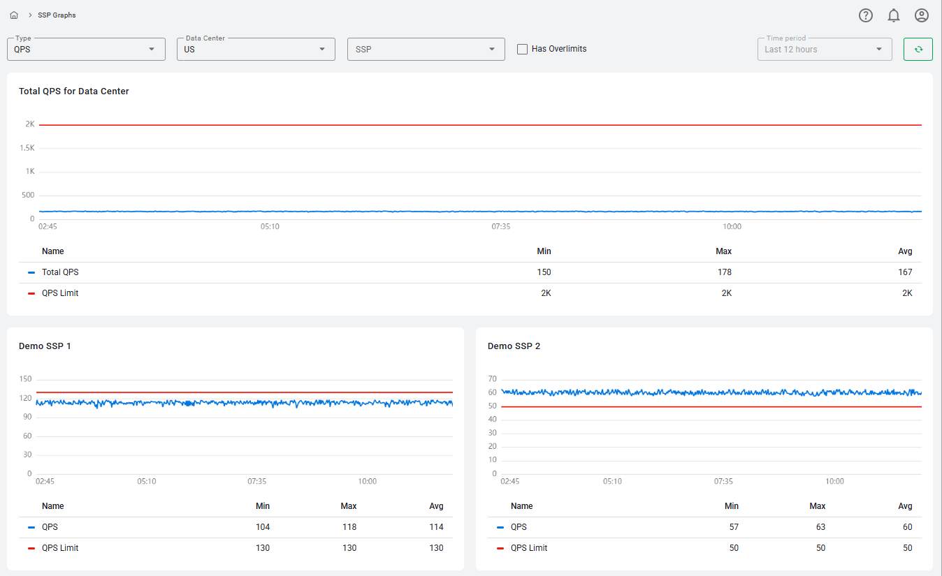
The QPS graph is prominently displayed at the top of the SSP Graphs window and provides a comprehensive overview of total QPS across all SSPs for the selected datacenter.
- Blue Line: Represents the total QPS, which includes both HTTP requests and filtered HTTP requests.
- Red Line: Indicates the current limit of QPS for the selected datacenter to help users monitor capacity thresholds.
- Data Table: Displays the Minimum, Maximum, and Average QPS values for the selected 5-minute period.
Each point on the graph represents one second, with a total of 300 dots covering the 5-minute timeline. Users can hover over any dot to see the current QPS value at that specific second.
Individual SSP Graphs
Below the main Live QPS graph, individual graphs for each selected SSP are displayed. These graphs also feature:
- Blue Line: Total QPS for the SSP.
- Red Line: SSP-specific QPS limit.
- Data Table: Shows Minimum, Maximum, and Average values.
Like the main graph, these individual graphs allow users to hover over the timeline to view second-by-second data, providing detailed insights into SSP performance.
By utilizing these features, users of RTB-Stack can effectively monitor and analyze the performance of their SSPs, making informed decisions based on real-time and historical data.
Average Requests Graph
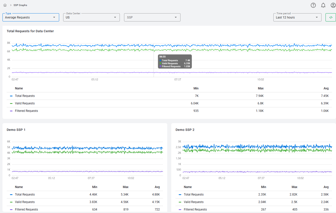
The Total Requests for Data Center graph is prominently displayed within the SSP Graphs section of RTB-Stack, providing a detailed view of total, valid and filtered requests for a selected data center. This graph is crucial for monitoring the overall request load and understanding traffic patterns over time.
- Blue Line - Total Requests: Represents the total HTTP and filtered HTTP requests for all SSPs within the selected data center.
- Green Line - Valid Requests: Indicates only successfully processed HTTP requests.
- Purple Line - Filtered Requests: Shows the number of requests that were rejected or filtered.
- Data Table: Positioned below the graph, this table displays the Minimum, Maximum, and Average requests, offering a quick statistical overview of request volumes during the selected period.
Individual SSP Graphs
Below the main Total Requests for Data Center graph, individual graphs for each selected SSP are displayed. These graphs provide a focused view of request activity for each SSP.
- Blue Line: Shows the total HTTP and filtered HTTP requests for the selected data center for this specific SSP.
- Green Line: Shows valid HTTP requests for the selected data center for this specific SSP.
- Purple Line: Shows filtered HTTP requests for the selected data center for this specific SSP.
- Data Table: Below the graph, it displays the Minimum, Maximum, and Average requests for the SSP, allowing users to assess individual SSP performance.
These detailed graph views in the SSP Graphs section of RTB-Stack empower users to effectively monitor and analyze the performance of their SSPs and endpoints. The combination of real-time data visibility, flexible time period selection, and interactive features ensures that users have access to comprehensive and actionable performance metrics.