DSP Graphs
The DSP Graphs section in the RTB Stack provides detailed visualizations of outgoing Query Per Second (QPS) metrics. This tool is designed to help monitor traffic flow to demand partners and ensure that bidding activity remains within established capacity limits.
Settings and Filters
Use the top navigation bar to filter the data displayed in the graphs:
- Type: Currently fixed to QPS.
- Data Center: Select the data center from those associated with the user's account (US, EU, Asia).
- View by: Toggle between DSP or Profile to change the granularity of the individual graphs.
- DSP: A dropdown menu allowing to select specific demand partners for which statistics are available.
- Time period: This is fixed to the last 12 hours to provide a high-resolution view of recent traffic trends.
- Refresh: Updates the graph data manually.
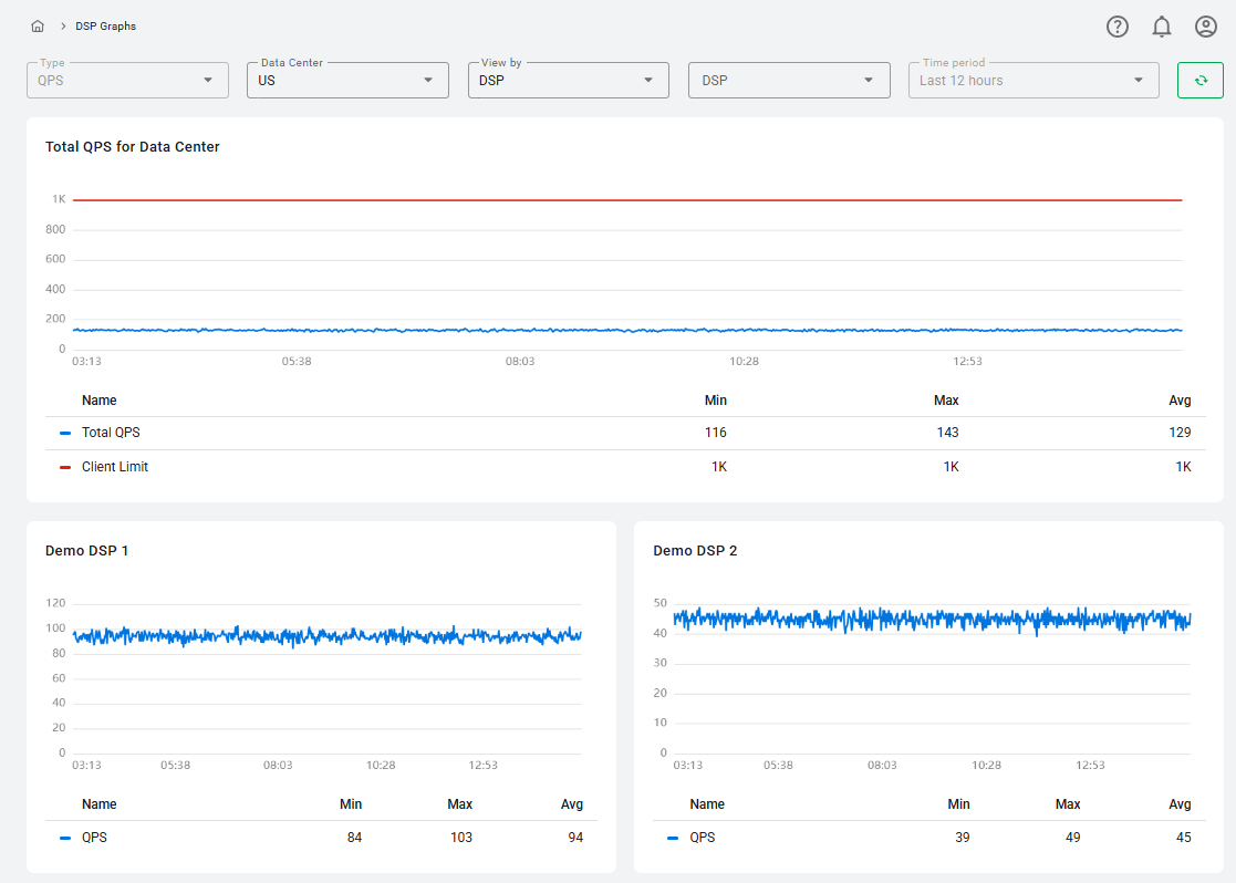
Total QPS for Data Center Graph
The main graph provides an overview of your total outgoing traffic for the selected data center:
- Total QPS (Blue Line): Displays the sum of QPS for all DSPs for the selected datacenter, calculated based on the top QPS value recorded per minute.
- Client Limit (Red Line): Represents your account's total outgoing QPS limit for that specific data center. Monitoring this line helps prevent traffic spikes from exceeding your contractual capacity.
Each point on the graph represents one minute. Users can hover over any point to see the top QPS value for that specific minute.
Individual DSP and Profile Graphs
The behavior of the individual graphs below the main dashboard changes based on your View by selection:
When View by = DSP
- The graph displays a single "QPS" line for the selected partner.
- Metrics are calculated based on the top QPS value per minute.
When View By = Profile
- A Profile dropdown picker will appear, containing only the profiles associated with the selected DSP that have available statistics.
- QPS Line: Displays the bidding activity for that specific profile.
- QPS Limit (Red Line): If a specific QPS limit is defined for the profile in that data center, a red limit line will be displayed. If no limit is set, the line and its entry in the legend will be hidden.
Data Summary Table
Each graph is accompanied by a data table that summarizes the performance metrics for the selected time period:
- Min: The lowest QPS value recorded during the 12-hour period.
- Max: The highest peak QPS value recorded during the 12-hour period.
- Avg: The average QPS value calculated across the selected timeframe.